Member Portal
Horizon Blue Cross Blue Shield of NJ Member Portal
View explanation of benefits, claims, find a doctor, chat with a nurse, get resources from WebMD, take a health assessment and more.
Overview
The member portal was Zipari’s first project with Horizon Blue Cross Blue Shield. This was a huge undertaking moving from a legacy system to Zipari’s platform. It was my job to lead the MVP design of the member portal along with a small team at Horizon. The design needed to be scaleable enough to sell to other clients as a white-labeled product but suit the immediate usability needs of Horizon.
I worked in-house at Horizon and was able to obtain a vast knowledge of the portal from subject matter experts. I worked in tight, two-week sprints utilizing Jira and Confluence. At the end of each sprint I demoed in front of multiple steak-holders.
The goal of the member portal was to promote self service and increase digital engagement and to eventually be white labeled and sold to other Zipari healthcare clients. It needed to be user friendly, mobile responsive and WCAG compliant.
Usability Testing
At Horizon I was able to utilize moderated and unmoderated usability testing, data analytics from Horizon’s previous portal, Optimal Workshop for card sorting and IA testing.
Usability testing and analytics were crucial and allowed me to validate my designs when a steak-holder had questions about a particular design choice. We tested every feature that was rolled out for every sprint. For desktop we generally targeted male and female users between the ages of 45 - 64 years old within New Jersey. I worked with Horizon’s Customer Experience and Marketing teams to build out simple personas for the design team.
Horizon Blue Cross Blue Shield of NJ Personas
I.D. Card UX Research
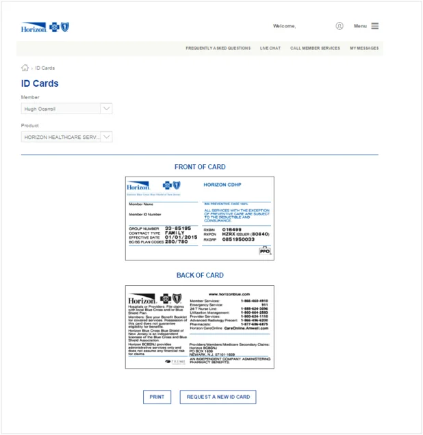
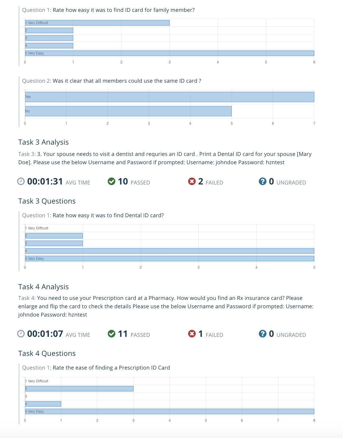
I started with a simple heuristic analysis of the I.D. card page, looked at previous analytics, sent out surveys, and did user testing on the previous design. Though it seems like a simple page, after research users were clearly having issues that needed to be addressed. Based on research I made significant changes to the layout and copy of the page then retested utilizing unmoderated tests. After redesigning the page 7 out of 7 unmoderated users were able to successfully complete I.D. tasks, and during first impression testing, users rated the design “very easy to use.”
Examples of Research Findings
The first usability test sessions indicated that more than 50% of members did not understand what a coverage letter was.
For some members, the alphanumeric characters were missing on the ID Card shown online.
The usability test sessions indicated that some users did not see the I.D. Card shown online.
Users did not immediately see an option to download the ID Card.
40% members were confused who the I.D. cards were for (Subscriber or Dependent).
2% (800 members) encountered the “Technical difficulties” error.
9% (329 members) encountered the “Image of the ID Card not available” error.
I.D. Card UX Recommendations & Proposed Low Fidelity Wireframe
Update copy so users understand and potentially add tool tips.
Several of these members mentioned they did NOT receive their ID Cards and when trying to load and print them, they were unable to do so.
Ensuring these cards are sent out and/or they have alternative access to their cards would alleviate their concerns over not having these cards when visiting a doctor.
Provide an option to print and mail on content pages like, SBC, plan documents, claims, and ensure the print links work.
Users should be able to download and zoom into their ID Cards.
Users should be able to save the I.D. Card as an image on their mobile devices.
Example of Unmoderated User Test
Example of Unmoderated User Testing Analysis
Member Portal Information Architecture
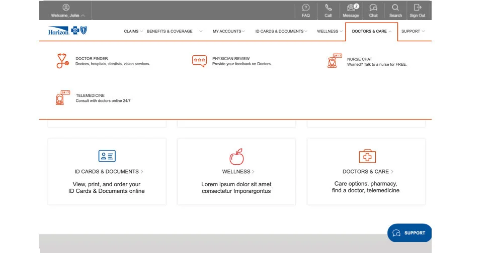
Restructuring the Information Architecture (IA) for the member portal was a huge undertaking, but an exciting challenge. Prior to the redesign, Horizon’s member portal did not utilize a consistent top navigation with bucketed information in a dropdown form. It utilized tiles on the homepage which brought the user to an additional page with more tiles. These tiles were acting like a navigation, however, they were frustrating for the user to flow through the portal in a quick manner. There were too many clicks and many of the tiles linked out to a third party site that was not a single sign-on (SSO). The user was not informed prior to clicking on the tile that they would need to sign-into another system.
Each tile did not specify what could be accomplished; some tiles were self-explanatory, others required further explanation. I was able to work with Horizon’s communications department to have a snippet of copy written for each tile. The extra copy below the title and icon clarified where the user would go if they clicked on that particular tile.
The hierarchy of the homepage suggested the “Support Options” were the most important navigation on the page. I was able to condense the support options to a one side navigational element, reducing its prominence within the portal.
Users questioned why there was no search feature on the homepage or within the navigation bar. They felt it would be a lot easier to search for items they needed than randomly click through tiles that had no explanation. I added a search icon that expanded the width of the homepage after clicking. This allowed users to quickly find information they needed if they could not find it within the new navigation and six homepage tiles.
I utilized Optimal Workshop’s Treejack software to test how users bucketed information and how they would find information within the portal. I also got the chance to do in-person card sorting exercises with Horizon members which allowed me to create a new navigation. By switching to Zipari’s platform Horizon was able to have a signal sign-on for all third party vendors which created a seamless experience within the navigation.
OLD Navigation
Navigation Design Iteration
NEW Navigation
Optimal Workshop Treejack Information Architecture Study Example
I created many surveys and card sorting exercises through Optimal Workshop. This research helped me establish a better information architecture for the member portal. Below is an example of a users journey through the member portal finding their payment history.
You are an individual Horizon BCBSNJ member who pays a monthly insurance premium. Where would you expect to find details of your payment history?
Horizon Member Portal Visual Design
Horizon already had an established style guide equipped with icon sets and fonts. Most of the wireframes I created in Axure were high-fidelity because we wanted to see how the user would interact with the visual design and interactions during user testing.
The member portal needed to be WCAG AA compliant. I worked with the Horizon visual designer to test color contrast, font size and labeling. During the development of this version of member portal I was working internally on a new design system. The new design system ensured all Zipari products looked consistent and saved development time.
Homepage Analytics August 2019
Beyond Horizon Member Portal
Horizon Blue Cross Blue Shield Member portal redesign was a major project with many lessons learned. There were many features within the portal that were Horizon specific that other clients would not need. Examples of features that might not be used by another client are wellness programs or the what’s covered section. These items needed to be stripped out of the portal to make a productized version that could be sold to other clients. The Zipari v3 member portal moved away from the six tile homepage design since many of the links were repeats of the navigation and did not provide enough context. I created a dashboard homepage design combining a care and administrative journey. The v3 portal is highly configurable. Member portal v3 is still being tested and researched but I have pulled a lot of the research and current analytics from the Horizon portal to inform my new designs.


